David Hockney is a bit of a jack of all trades, he has worked with many different styles and medias over the years. Some of my favorite work of his though is his work done in the 70's and his photo collages.
This is one of my favorite pieces of artwork. I love Hockney's use of colour, composition and lighting to create tension and mood. During this time Ossie Clark and his wife Celia Birtwell were going through a turbulent marriage and I feel this was depicted well with the composition of this painting. I feel this is relevant to my current brief as I am trying to create mood and atmosphere of being a twin.
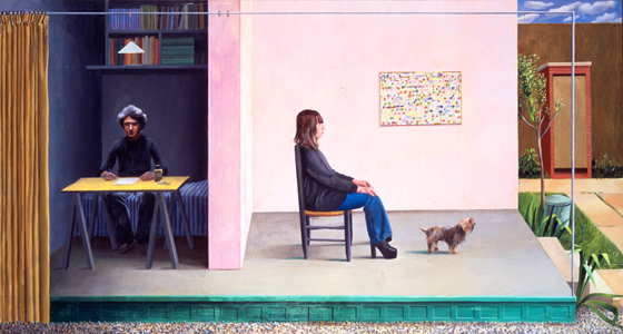
This is another example of a 70's Hockney work which varies so vastly from the previous painting. I like this painting because it has quite a lot of graphical elements. It's very simple but effective and again makes use of good composition to create mood.
Acrylic on canvas, crayon on canvas and coloured pencil.